You'll need this:
-
One of these Pointerpro plans:
![]() Professional
Professional ![]() Enterprise
Enterprise ![]() ReportR
ReportR ![]() DistributR
DistributR
On this help guide page:
1. Add a bar chart to the page
To add a column chart to the page, all you have to do is click on it and drag and drop it on the page.

Once you add the widget a pop-up window will open where you can setup the chart.
2. Setup the chart
Start by adding a Chart Type, we have the Simple and the Stacked option.
Simple Bar chart
The key building blocks of this graph are Dimensions and Metrics. Let's set it up together!
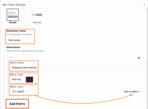
- Dimension name - this will be displayed underneath the graph in the legend.
- Metric name - this will be displayed on the left-hand side of the bar describing the type of data, for example, different topics or areas of skills.
- Metric color - click on the color selector to choose what color each column should be. You can make all bars the same color, or choose a different shade for each bar.
- Metric value - for each bar you can either type in a static number or click Variables to access the drop-down menu of available variables. Variables take the data entered during the survey and display it in the graph.
- Add Metric - click here to add another bar to be shown on the graph. Each metric displays one bar on the graph.
Start by filling in your Dimension Name. In our example we call it 'Own Score'.
Then move to configure your Metrics - give each metric a name, color and value. Continue to add them until you have the number that you need. You can include as many metrics as you want!
In the example below we added four metrics as such our widget will have four bars.

If you change your variable data, you must collect a new response in order to preview your graph.
Now you've set up your graph, you can also configure the last settings:

- Chart title - This title will be displayed above your chart
- Y-Axis scale interval - add a value to determine the spacing of the scale. In the example graph above, the scale interval is set at 20.
- Y-Axis max - add the maximum value that should appear at the right-hand end of the scale.
- Y-Axis title - this is the label that will be shown immediately under the y-axis. In our example above we call it 'Points'.
- Set the number of decimal places - choose here whether you want to show data values with any decimal places or none (just set to 0). Keep it simple - more than 2 decimal places may overload the graph with too much data.
- Y-Axis gap width - this is the spacing or gap in between the columns. This will adjust the gap width in percentage, and also increase or decrease the bar width.
When you are done click Save and close to save your work and view your chart.
Stacked Bar chart
The key building blocks of Stacked Bar Chart are Dimension Groups, Dimensions, and Metrics.
Start by clicking Add Group to create your bars. Give each group a label and continue to add groups until you have the number that you need. You can include as many groups as you want!
In the example below we added four groups as such our stacked bar chart will have four bars.
Now it's time to Add Dimension. Fill in first Dimension name, for example, 'Own Score' and select the dimension color. This will be shown in the legend underneath the graph.
Moving on to Add Metric. Note that the number of metrics must correspond to the number of groups so that you'll have a numeric value for each bar. In our example, we have added four dimension groups so we need to add four metrics.

Proceed by adding extra dimensions, those will be stacked inside each bar of your chart.
For example, if you want to compare respondent's score vs average. In the example below we add a second dimension 'Other managers in the organisation' with static numbers as metrics.
This is how our final stacked bar chart looks like: we use four Dimension Groups which turns into four bars and we have two Dimensions as such each bar consists of two stacked parts:

You can also add negative values into your dimension metrics as shown below.

3. Additional settings
Select the widget and then at the right of the screen click on the gear button. The widget list will be replaced by the additional settings.

Here you can find the following settings:
1. ID
This is the ID of the widget.
2. Name
You can name your widget in order to identify it easier.
3. Rules
You can add your widget logic rules to ensure that your content will be visible only when the conditions are true.
4. Margins
Add margins to create space around elements and move them on your page. By default the margins are set to 0, but you can change that anytime and add the margin you prefer.
You can add margins left and right to make your chart smaller. The bigger the margins, the smaller the chart. Note that the margins should be equal, in order for the chart to be centered in the page.
5. Background color
You can change the background color of this specific widget by clicking the color selector.
6. Chart settings
You can change the default title and label font size if you want. This is very useful if you are placing your chart inside a column, or you adjust its size. In this case you will have a smaller chart but your text will still be readable.
4. Additional buttons
When you click on your widget four blue buttons appear to the right.

The Arrow allows you to move between the different layers of the page. For example if you add a widget in a column then you have 3 layers: the page, the column and the widget. The arrow allows you to quickly select a different layer.
The second icon, the four arrow sign, allows you to move your widget up or down to the page.
The third icon, the page, allows you to copy this widget and the forth icon, the bin, to delete it.
What's next?
- Chart Widgets: Gauge chart: Add a gauge chart to your personalized PDF report to represent average or actual scores or percentage results for question blocks or formulas. Respondents can see at a glance if they've scored towards the top-end or bottom-end of the scale. It allows you to display a large data set visually.
- Chart Widgets: Spider chart: A spider chart is a great graphic way to compare results from different questions and visualize performance, for example between school subjects or departments of a business. You can include as many axes as you want, but the most visually appealing and clear would be between three and six axes.
- Chart Widgets: Bubble chart: The bubble chart widget allows your respondents to see their results from different questions but also compare them to other components. A bubble chart stands out because it allows a comparison between three variables.
Don't want to build it yourself? Contact our professional services team
