You'll need this:
-
One of these Pointerpro plans:
![]() Professional
Professional ![]() Enterprise
Enterprise ![]() ReportR
ReportR ![]() DistributR
DistributR
Check this video for a step-by-step Pie Chart configuration:
On this help guide page:
1. Add a pie chart widget
To add a pie chart to the page, all you have to do is click on it and drag and drop it on the page.

Once you add the widget a pop-up window will open where you can setup your chart.
2. Setup the chart
The key building blocks of this graph are data items that are displayed on the graph as slices of the pie chart. Let's see now how to set up this component!
When the chart settings window opens, click Add Data item and fill in the following information.
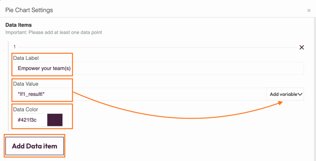
- Data Label - give a name to the section of the graph. This name will be shown in the legend under the graph.
- Data Value - you can either type in a number or click Variables to access the drop-down menu of available variables. Variables take the data entered during the survey and display it in the graph.
- Data Colour - choose the section colour by clicking on the colour selector. Take care to choose distinctly different colours for each section so the graph will be easy to read.
If you change your formula data, you must collect a new response in order to preview your graph.
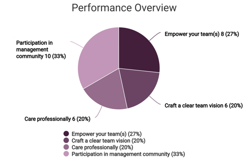
In our example we added four data items and this is how the pie chart looks like:
Now you've set up your graph, you can also configure the last settings.
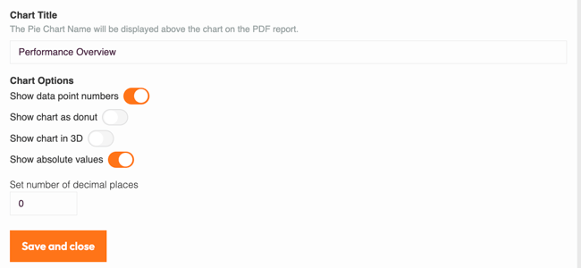
- Chart title - This title will be displayed above your chart
- Show data point numbers - toggle to display the percentage value for each section of the graph. When it's turned off, the percentages will not be shown on the graph itself, but will only appear on the legend underneath.
- Show chart as donut - turn this on and your graph will lose its middle and look more like a donut! (An example is shown just below)
- Show chart in 3D - here's how your graph will look like if you turn on 3D.
- Show absolute values - toggle to add the actual data values rather than only the proportions of the graph.
- Set number of decimal places - here you can specify how many decimal places you want to be displayed for percentages and for absolute values if you have chosen to show these. Note that if you choose more than 2 decimal places, the graph is going to be smaller. Make sure to increase the graph width so data labels are not cut off. Read on to learn how to do this.
Here is an example of a donut and a pie chart in 3D:

3. Additional settings
Select the widget and then at the right of the screen click on the Settings button. The widget list will be replaced by the additional settings.

Here you can find the following settings:
1. ID
This is the ID of the widget.
2. Name
You can name your widget to identify it easier.
3. Rules
You can add your widget logic rules to ensure that your content will be visible only when the conditions are true.
4. Margins
Add margins to create space around elements and move them on your page. By default, the margins are set to 0, but you can change that anytime and add the margin you prefer.
You can add margins left and right to make your chart smaller. The bigger the margins, the smaller the chart. Note that the margins should be equal, in order for the chart to be centered in the page.
5. Background colour
You can change the background colour of this specific widget by clicking the color selector.
6. Chart settings
You can change the default title and label font size if you want. This is very useful if you are placing your chart inside a column, or you adjust its size. In this case you will have a smaller chart but your text will still be readable.
4. Additional buttons
When you click on your widget, 4 blue buttons appear to the right.

The Arrow allows you to move between the different layers of the page. For example, if you add a widget in a column then you have 3 layers: the page, the column, and the widget. The arrow allows you to quickly select a different layer.
The second icon, the four arrow sign, allows you to move your widget up or down to the page.
The third icon, the page, allows you to copy this widget and the forth icon, the bin, to delete it.
What's next?
- Chart Widgets: Bar chart: Add a Bar Chart widget to your customized report to show respondents' results or another data set at a glance. This way you will display your data with rectangular bars. It allows you to show data separated into categories with relative numbers.
- Chart Widgets: Gauge chart: Add a gauge chart to your personalized PDF report to represent average or actual scores or percentage results for question blocks or formulas. Respondents can see at a glance if they've scored towards the top-end or bottom-end of the scale. It allows you to display a large data set visually.
- Chart Widgets: Spider chart: A spider chart is a great graphic way to compare results from different questions and visualize performance, for example between school subjects or departments of a business. You can include as many axes as you want, but the most visually appealing and clear would be between three and six axes.
Don't want to build it yourself? Contact our professional services team
