You'll need this:
-
One of these Pointerpro plans:
 Professional Enterprise
  ReportR DistributR
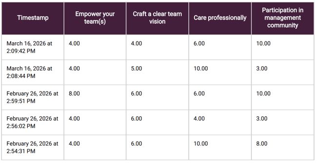
Here's how a response table could look like in your report:
On this help guide page:
1. Add a response table
To add the widget to the page, all you have to do is click on it and drag and drop it on the page.
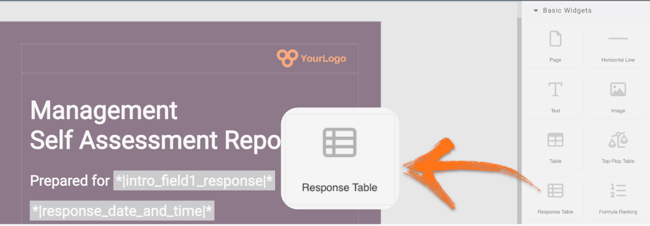
Once you add the widget a pop-up window will open where you can add your content.
2. Setup the widget
First, you will set up the data that will appear in the table by configuring your columns. First column named Timestamp will be added to your response table automatically, but you can remove it if not needed.
Below you can see available columns settings: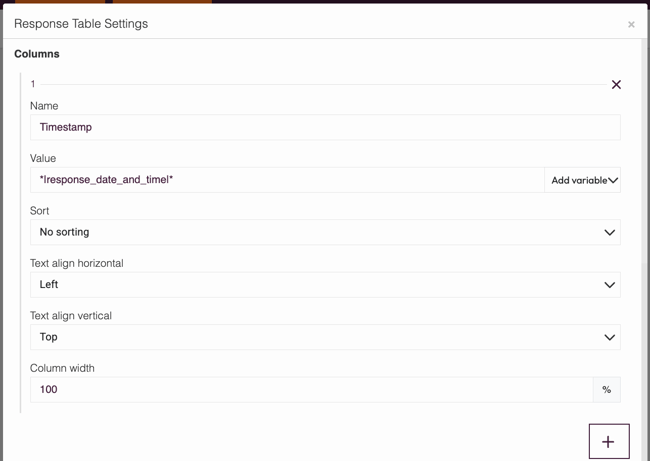
- Name - Give the column a name so respondents will know what data they are being shown.
- Value - This can be a static number that you fill in or a variable that you can choose from Add variables menu.
- Sort - Use the drop-down arrow to choose how to sort the results. No sorting is the default option, but you can choose to sort results from highest to lowest or vice versa.
- Text align horizontal - Use the drop-down arrow to choose how the text will be positioned: Left, Center or Right.
- Text align vertical - Use the drop-down arrow to choose how the text will be positioned: Top, Middle or Bottom.
- Column width - use this input field to configure column width in percentage (%). If you want to have equal columns width just divide 100% by number of columns you have and input that number for each column.
- Add column ('+') - Add as many columns as you need. Adding another column will bring up the same 3 options, so repeat steps 1-3 to choose what to display in the next column.
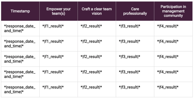
In the example below we have widget with 5 columns: date and time of the response and 4 categories. We use variables as values:
Now you've set up your graph, you can also configure the last settings.
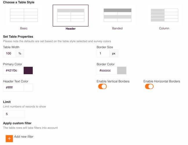
- Choose a Table Style - Decide the look of your response table. Available options: Basic, Header, Banded or Column.
- Adjust the Table Width.
- Select your Primary Color from the color selector.
- Select your Header Text Color from the color selector.
- Limit the number of rows that will be displayed.
- Configure Border Size in pixels.
- Select Border Color from the color selector.
- Use toggles to enable or disable Vertical and Horizontal Borders.
- Click the '+' (plus) sign to Add custom filter to your table. Only records that match this filter will be displayed in the table. The default filter type is based on answers to a particular question. If you'd like to change this, click the arrow to access the drop-down menu of all available filter options, such as intro field, date, language, quiz score and other.
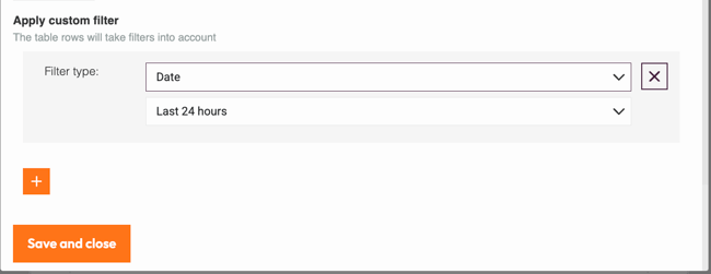
Don't forget to click Save and close!
The custom filter is useful if you want to always show the table, but only want data shown if it matches certain criteria. If you want to only display this widget, for example, for a particular company department, you can set the logic widget rules. The conditions for the custom filter and the widget logic rules don't need to be the same. Eg, set a custom filter to only display rows of data for those who answered the English version of the survey, and the widget logic rules could state that the entire widget should only be displayed to those in a particular company department.
3. Additional settings
Select the widget and then at the right of the screen click on the Settings button. The widget list will be replaced by the additional settings.
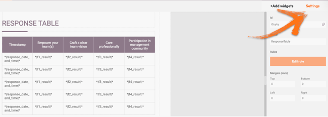
Here you can find the following settings:
1. ID
This is the ID of the widget.
2. Name
You can name your widget to identify it easier.
3. Rules
You can add your widget logic rules to ensure that your content will be visible only when the conditions are true.
4. Margins
Add margins to create space around elements and move them on your page. By default, the margins are set to 0, but you can change that anytime and add the margin you prefer.
4. Additional buttons
When you click on your widget, 4 blue buttons appear in the upper right corner.
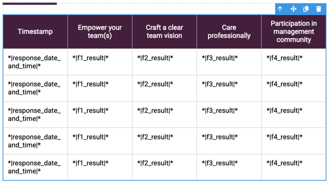
The Arrow allows you to move between the different layers of the page. For example if you add a widget in a column then you have 3 layers: the page, the column and the widget. The arrow allows you to quickly select a different layer.
The second icon, the four arrow sign, allows you to move your widget up or down to the page.
The third icon, the page, allows you to copy this widget and the forth icon, the bin, to delete it.
What's next?
- Report Builder - PDF step-by-step example: Check out our step by step guide to create an attractive and stylish PDF. It includes videos but also very detailed instructions.
- Basic Widgets: Table: The Table widget allows you to display results clearly and concisely to your respondents. It is an easy and fast way of displaying any data in rows and columns. Rather than writing your data in text, you can make it more understandable and easy to read with this widget.
- Basic Widgets: Text: The Report Builder text widget allows you to write and display your content in your report. You can use it to give further information about questions, give feedback or explain a particular answer. This is an absolutely essential building block of your PDF report.
Don't want to build it yourself? Contact our professional services team
