You'll need this:
-
One of these Pointerpro plans:
![]() Professional
Professional ![]() Enterprise
Enterprise ![]() ReportR
ReportR ![]() DistributR
DistributR
On this help guide page:
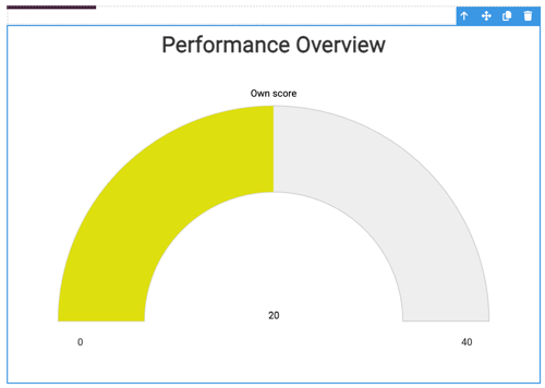
1. Add a gauge chart to the page
To add a gauge chart widget to the page, all you have to do is click on it and drag and drop it on the page.
Once you add the widget a pop-up window will open where you can setup the chart.
2. Setup the chart
Start by filling in first chart settings:

- Chart title - This title will be displayed above your chart
- Y-Axis min - Enter a value for the lowest value for the chart. The minimum value will be shown under the graph on the left-hand side.
- Y-Axis max - Enter a value for highest value for the chart. The maximum value will be shown under the right-hand end of the graph.
The Y-Axis values can be any value you like (they do not have to be between 0 and 1 as the threshold values). - Y-axis title - Name the progress bar. This title will show immediately on top of the bar, as opposed to the Title which is displayed in larger letters above the Y-axis title.
- Set number of decimal places - Set this to 0 if you do not wish to show any decimal places. Otherwise choose how many decimal places you want, bearing in mind that too many decimal places are not so useful to the report reader.
Now it is time to set thresholds. The values you set for the thresholds will determine the shading of the progress bar. Change the color so that a higher score will have a different or brighter color than a lower score.

- Enter needed threshold value. This must be a number between 0 and 1. The values entered will be converted into percentages, e.g. a threshold value of 0.1 will cover the first 10% of the bar.
- Click the color selector to change the color of each threshold. The default shades would color the bar in red for the lowest scoring answers, yellow for mid-ranking scores, and for top-scoring answers, the bar would be colored in green.
If you want more than 3 colors of the progress bar, that's no problem! Simply click Add threshold and add as many as you require. Keep in mind that the threshold value must be between 0 and 1!
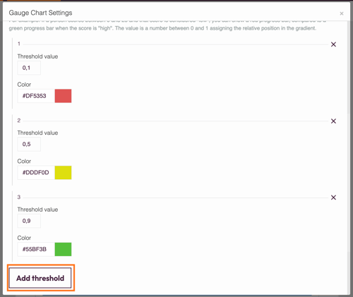
The values for the thresholds must be entered in order, starting with the lowest value (threshold #1) and increasing to the highest value.
If a score is in between 2 thresholds, a mix of the 2 threshold colors will be shown on the gauge. In order to have it as 1 color, you need to set up minimum and maximum threshold values.
Now add your metric value! You can either type in a number or click Variables to access the drop-down menu of available variables. Variables take the data entered during the survey and display it in the graph.
Make sure the variable is a numerical value otherwise the graph will not work!

Then click the Save and close button to save your work and view your chart.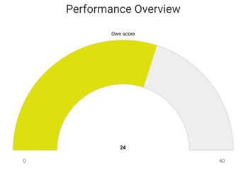
3. Additional settings
Select the widget and then at the right of the screen click on the Settings button. The widget list will be replaced by the additional settings.
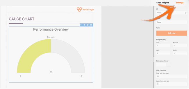
Here you can find the following settings:
1. ID
This is the ID of the widget.
2. Name
You can name your widget in order to identify it easier.
3. Rules
You can add your widget logic rules to ensure that your content will be visible only when the conditions are true.
4. Margins
Add margins to create space around elements and move them in your page. By default the margins are set to 0, but you can change that anytime and add the margin you prefer.
You can add margins left and right to make your chart smaller. The bigger the margins, the smaller the chart. Note that the margins should be equal, in order for the chart to be centered in the page.
5. Background color
You can change the background color of this specific widget by clicking the color selector.
6. Chart settings
You can change the default title and label font size if you want. This is very useful if you are placing your chart inside a column, or you adjust its size. In this case you will have a smaller chart but your text will still be readable.
4. Additional buttons
When you click on your widget, 4 blue buttons appear to the right.
The Arrow allows you to move between the different layers of the page. For example, if you add a widget in a column then you have 3 layers: the page, the column, and the widget. The arrow allows you to quickly select a different layer.
The second icon, the four arrow sign, allows you to move your widget up or down to the page.
The third icon, the page, allows you to copy this widget and the forth icon, the bin, to delete it.
What's next?
- Chart Widgets: Bar Chart: Add a Bar Chart widget to your customized report to show respondents' results or another data set at a glance. This way you will display your data with rectangular bars. It allows you to show data separated into categories with relative numbers.
- Chart Widgets: Bubble chart: The bubble chart widget allows your respondents to see their results from different questions but also compare them to other components. A bubble chart stands out because it allows a comparison between three variables.
- Chart Widgets: Pie Chart: Add a Pie Chart widget to your customized report to show respondents' results at a glance. This is a great way of displaying data in proportions and representing a rough estimate of percentages.
Don't want to build it yourself? Contact our professional services team
