You'll need this:
-
One of these Pointerpro plans:
![]() Professional
Professional ![]() Enterprise
Enterprise ![]() ReportR
ReportR ![]() DistributR
DistributR
Custom chart is a special type of graph that allows the user to customize the data he wants to include in the graph completely. The user can include formulas and variables or hardcoded data as values that will be graphically represented.
The Custom Chart widget has multiple templates. For each template, there is a specific CSV file that can be downloaded. Here's an example:

This widget is available for ReportR plan upon request.
On this help guide page:
1. Add a custom chart to the page
To add a custom chart widget to the page, all you have to do is click on it and drag and drop it on the page.
 Once you add the widget a pop-up window will open where you can setup the chart.
2. Setup the chart
Click the arrow next to the Chart type and select from the dropdown menu the type of chart that you want to use.
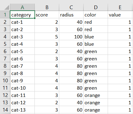
The next step is to download the CSV example by clicking "here", as shown below, and then to add the values that you want.
Every chart has another content and format, so do not forget to first select the one you want to use from the dropdown list and then download the CSV file. In this file, you can change the name of the columns and add variables, but you should not add or delete columns and rows or change the format, as you risk to break the chart!
First you need to convert your CSV file to Excel, in order to create different columns. For more info, take a look at the CSV guide.
Then you would have to adjust your data in the Excel File:
When you are finished with the editing of the your file you can save as CSV, click on Upload and choose the CSV that you just created.
It's possible to use variables and formulas like *|f1_result|* in your CSV file.
You can preview your data if you click the View uploaded data button.
Then adjust the chart height and width and click Save and close to add the chart to your page.
The max-width of one page is 810 px. To leave some room for spacing the recommended Width value is around 600 px.
Take a look below at some different layout possibilities:

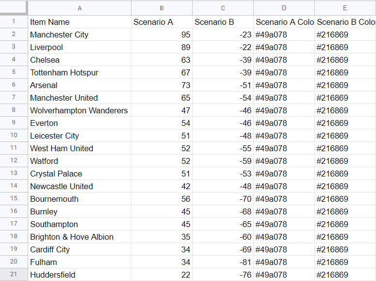
Here are some examples of graphs and their CSV files:
1. SA-1 Graph


2. SA-2 Graph


3. SA-3 Graph

4. SA-4 Graph


5. SA-5 Graph

6. Diverging Bar chart

3. Additional settings
Select the text widget and then at the right of the screen click on the gear button. The widget list will be replaced by the additional settings.

Here you can find the following settings:
1. ID
This is the ID of the widget.

2. Name
You can name your widget in order to identify it easier.

3. Rules
You can add your widget logic rules to ensure that your content will be visible only when the conditions are true.

When you click the Edit rule button a new pop-up window will appear.
 Select from the dropdown menu the option you want, and then fill in all the required fields. Once you add everything you can click the Submit button.

Your content will not be displayed on the page anymore, instead of the content you will be able to see the widget logic rules.

If you would like to edit your content again just click on the rule and the widget will expand. To edit the rule you would have to click on the Edit rule at the settings.

This is the window where you can delete the rule by clicking on the Delete rule button.

4. Margins
Add margins to create space around elements and move them in your page. By default the margins are set to 0, but you can change that anytime and add the margin you prefer.

4. Additional buttons
When you click on your widget, 4 blue buttons appear to the right. 
The Arrow allows you to move between the different layers of the page. For example, if you add a widget in a column then you have 3 layers: the page, the column, and the widget. The arrow allows you to quickly select a different layer.
The second icon, the four arrow sign, allows you to move your widget up or down to the page.

The third icon, the page, allows you to copy this widget, and the forth icon, the bin, to delete it.
What's next?
- Renewed Report Builder-Bubble chart: The bubble chart widget allows your respondents to see their results from different questions but also compare them to other components. A bubble chart stands out because it allows a comparison between three variables.
-
Renewed Report Builder-Bar chart: Add a Bar Chart widget to your customized report to show respondents' results or another data set at a glance. This way you will display your data with rectangular bars. It allows you to show data separated into categories with relative numbers.
- Renewed Report Builder-Gauge chart: Add a gauge chart to your personalized PDF report to represent average or actual scores or percentage results for question blocks or formulas. Respondents can see at a glance if they've scored towards the top-end or bottom-end of the scale. It allows you to display a large data set visually.
